
Native Instruments is a global manufacturer of innovative music technologies comprising software and hardware. The company is known for pushing technological boundaries resulting in exploring uncharted horizons to deliver compelling solutions for musicians, producers and sound designers of all levels.
Over the past years, Native Instruments released a wide range of state-of-the-art music assets (i.e. plugins, sound libraries, virtual instruments). These assets are managed and deployed via Native Access, a desktop client used by 650,000 users globally.
However, as the asset catalog expanded exponentially, a design and technology upgrade for Native Access became essential safeguarding an uninterrupted productivity for customers comprising sound designers, producers, and musicians.
From a UX perspective, the problem became apparent. Users (including myself as an existing client), found it increasingly cumbersome to manage and update these extensive asset libraries via Native Access. With some users managing hundreds (100s) of assets, it became clear that an efficient solution was needed to simplify asset management via functions leveling searchability, findability, repairs, updates, and more.
This project was coordinated among 5 product teams, each comprising:
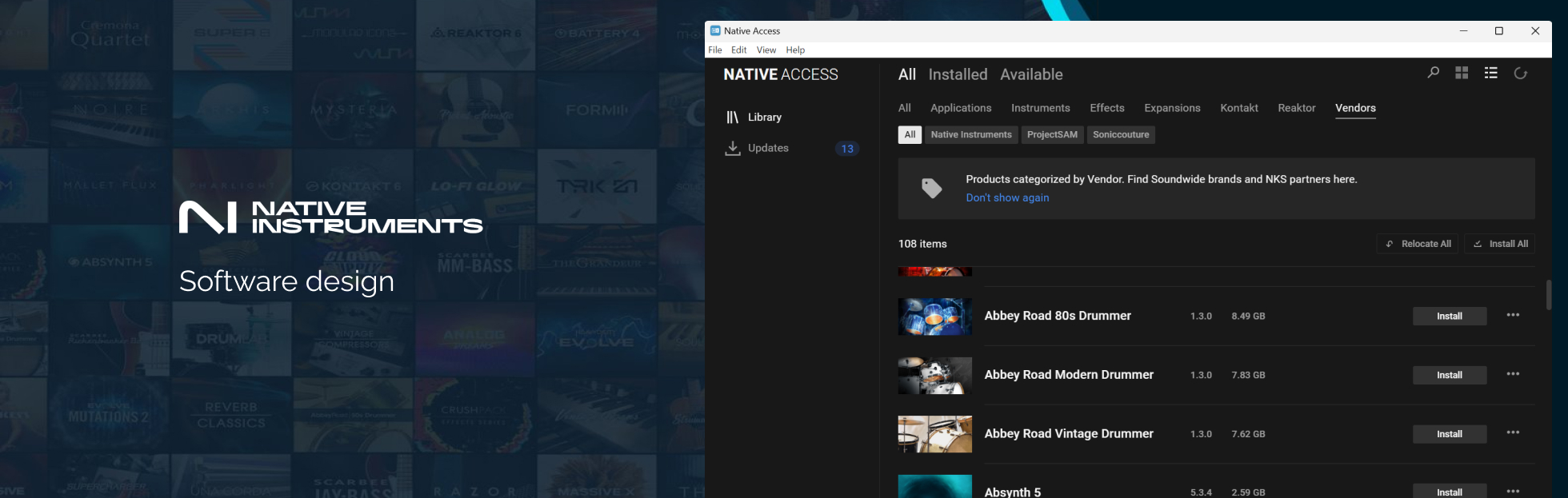
Native Access 2 (2023)
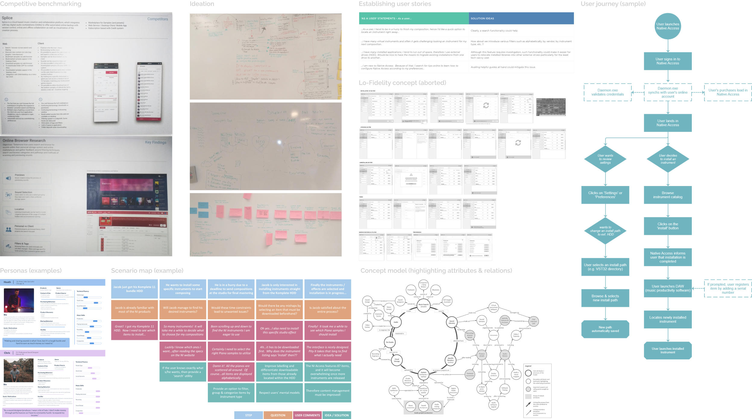
Together with 5 product teams, we embarked on an ambitious journey to redefine the experience of this products. We devised a roadmap and sprints comprising an array of tasks split among these 5 teams. My role was multifaceted, involving independent tasks and collaborative efforts with product owners (PO), software developers and other designers. Often, we ran workshops involving numerous stakeholders to spark ideation and foster discussions, addressing complex technical dependencies together. Throughout this laborious procedure, I prototyped an MVP concept fortified by capabilities including asset filtering and the functionality to relocate asset installations between HDDs.
Native Access (previous design)
")
I interviewed 15 participants comprising existing customers to learn about their preferences and dislikes regarding the product.
Simultaneously I ran a thorough audit on the (old) Native Access to identify pitfalls undermining UX, plus opportunities for improvement. The product carried a myriad of limitations, the notable ones being:
Clearly, something had to be done to rectify the matter moving forward.
Card sorting (part of a Wizard of Oz protocol)

“As a user, I have many assets and often it gets challenging looking an instrument I need for my next composition…”
Defining appropriate asset filtering was challenging. Luckily, some music students visited the offices to test new products. Fast forward, I tasked 5 students with a closed card-sorting exercise by administering 10 filters in paper format. Participants were instructed to sort filters ranging from the strongly preferred down to the least preferred.
Later, filtering options were defined and later introduced in the concept design and ultimately in the finalized product available at Native Instruments.
Numerous preliminary concepts and prototypes were created and refined through iterative processes until we reached consensus among stakeholders. I advocated for retaining the familiar Native Access UI structure for several key reasons:
Several concepts are exemplified below:
Native Access 2 (preliminary concept design)

Native Access 2 (asset relocation, a function I proposed)

The project was placed on hiatus since late 2018 and resumed at a later date. Ever since I was no longer part of the company as my contractual obligations were fulfilled. Nevertheless, the new Native Access significantly incorporates many of the ideas and functionalities I originally proposed, developed, and validated among users back then.


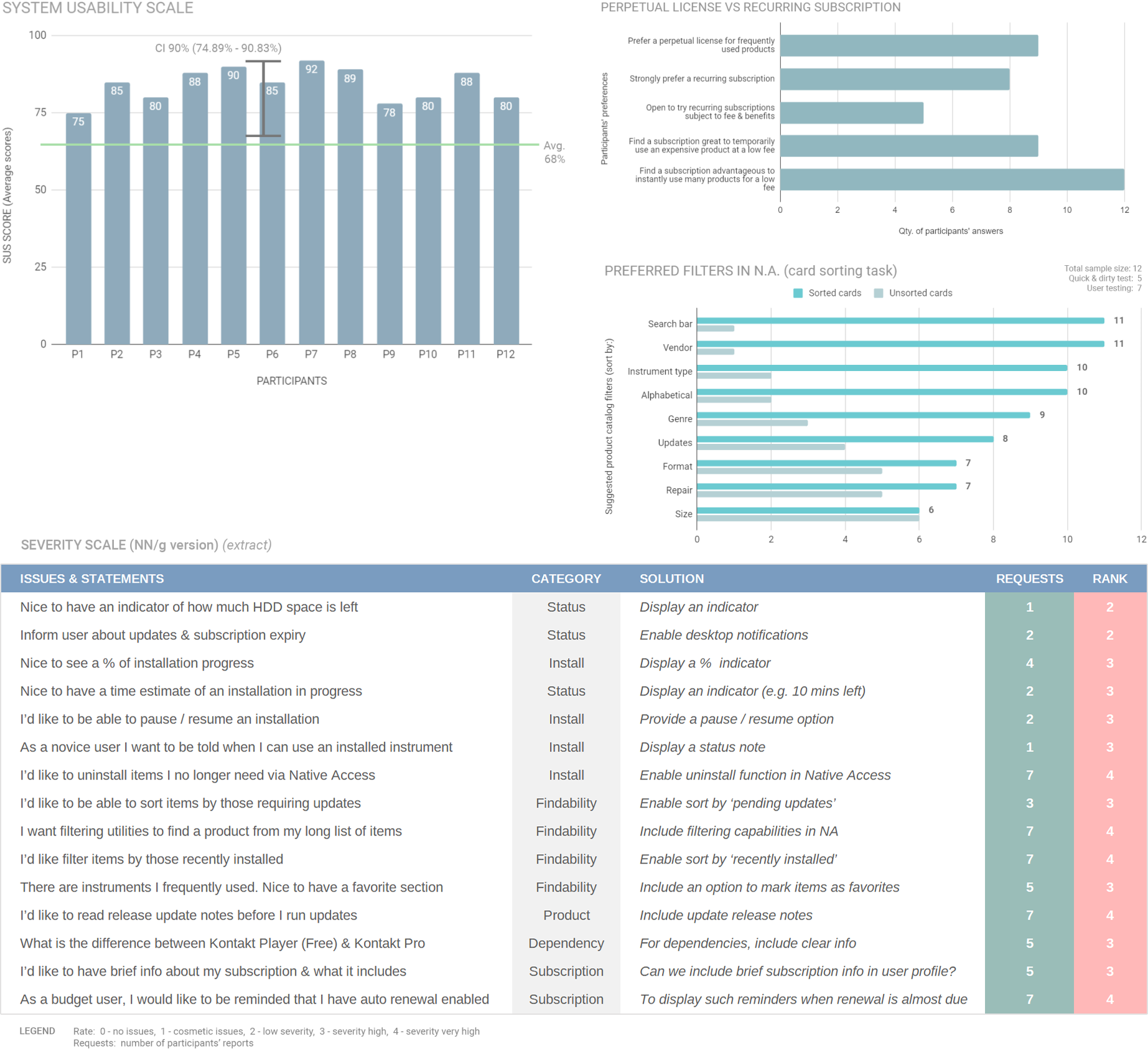
Finally, I evaluated the (MVP) concept for Native Access v.2 via moderated evaluative sessions by recruiting 12 participants being musicians, producers, and students. These sessions comprised interviews, a few exercises (e.g. task-based scenarios, preference tests, card sorts), plus a survey study (using the system usability scale, SUS).
All participants found the product easy to use and understand yielding an 80% acceptance rate.
Lastly, results from the survey study suggested that an est. 75% of the broader audience (i.e. users) would find the product easy to use and understand.
After fulfilling responsibilities in 2018, the project was placed on hold indefinitely due to technicalities requiring investigation. The new Native Access was launched in December 2022 – January 2023, carrying many functions (e.g., filtering, searchability) I proposed and crafted.
Native Access and Native Access v.2 – A comparison by a user via YouTube. The user shares his hurdles using the old Native Access with 200 assets, versus his relief after leveraging the asset filtering introduced in Native Access v.2. Full video: youtube.com/watch?v=tbyXioNjmfA